Two small touches separate a tidy document from an improvised one: numbered pages and, when needed, a clear status mark like DRAFT. Both take under a minute once you know the conventions, and both save your readers time, because they can refer to "page 14" instead of "somewhere in the middle".
Where should page numbers go?
Bottom center is the safest choice and works for almost any document. Bottom right suits reports that will be printed double-sided and bound, because the number sits at the outer edge. Top positions work well for letters and legal documents. Whatever you pick, keep it the same on every page and keep it at least 10 to 15 mm from the edge so printers do not clip it.
Skip the cover page
Cover pages are normally unnumbered. In Add Page Numbers, set Start numbering on page to 2. If you want the first numbered page to read "1", leave the first number at 1. If the cover counts as page 1 but just does not show it, set the first number to 2 so the second page reads "2".
Choose "Page 3 of 20" if the document will be printed, since it reveals a missing or out-of-order sheet instantly.
Numbering a combined document
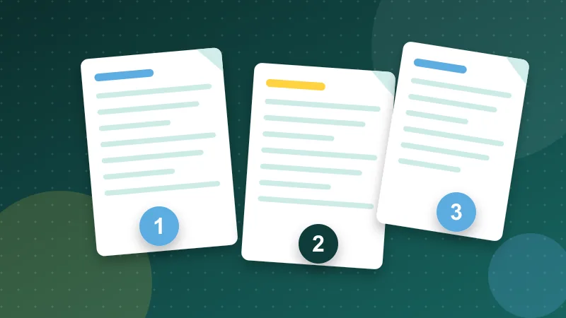
Merge first, number second. Put all the parts together with Merge PDF, then add numbers once so they run through the whole file. If you number each part first and merge afterwards, you end up with several sequences, and a reader cannot tell where page 3 is.
Numbers adapt to pages that are rotated, so a landscape page in a portrait document still gets a number that reads the right way up.
Using watermarks well
A watermark says something about status or ownership: DRAFT, CONFIDENTIAL, COPY, or a logo. Keep it subtle. Around 20 to 30 percent opacity at a 45-degree angle stays visible without blocking the text. Use the repeating layout only for sensitive material, because it makes reading harder.
Open Watermark PDF, type your text or upload a transparent PNG logo, adjust opacity and apply it to every page. Text is drawn as an image, so any language works, including Arabic, Chinese and Cyrillic.
Choose text, image or both?
- Text is best for status: DRAFT, FOR REVIEW, CONFIDENTIAL.
- A logo suits branded documents and portfolios. Use a transparent PNG and keep it at around 30 to 40 percent of the page width.
- Repeated tiles are for documents you are sending to many people for review, where you want to discourage casual reuse.
Know the limits
A watermark is a visible marker. It deters casual reuse but is not security. Anyone with enough effort can remove or hide it, so never depend on it to protect truly confidential content. For private documents, control who receives them, and clear hidden details with Edit PDF Metadata before you send.