You want a smooth color transition behind a hero section or across a button — something with a bit more depth than a flat fill — and you're staring at linear-gradient() syntax trying to remember whether "to right" means the gradient starts on the right or ends there. A wrong guess means reloading the page, squinting at the result, and trying again.
This guide covers how to build a linear or radial gradient with a live preview instead of guesswork, what the direction options actually mean, and the one honest limitation worth knowing about the radial option before you rely on it for something specific.
What a CSS Gradient Actually Is
A gradient is a smooth transition between colors, rendered directly as a CSS background value rather than an exported image file. That distinction matters more than it sounds like it should: a gradient scales to any size or resolution with zero pixelation, loads instantly since there's no image file to fetch, and can be tweaked later by changing a couple of values instead of re-exporting and re-uploading a graphic.
My PDF's Gradient Generator builds this CSS for you — pick two colors, a type, and a direction, and you get a live preview alongside the exact code, ready to copy.
Linear vs. Radial Gradients
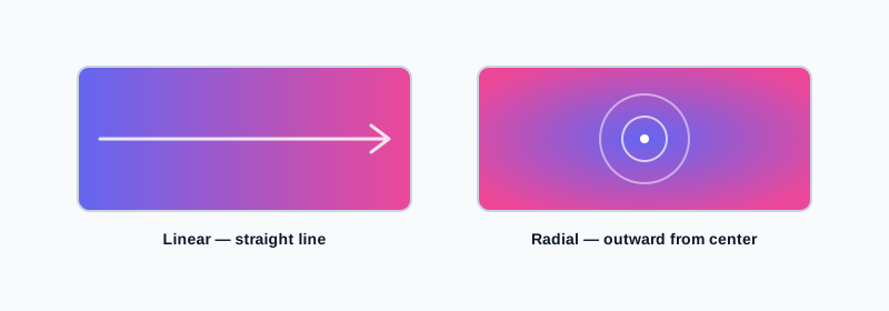
Linear gradients transition between colors in a straight line, in whatever direction you choose. They're the more common of the two — well suited to backgrounds, buttons, banners, and anywhere a directional flow of color makes sense.
Radial gradients transition outward from a center point in a circle, rather than along a straight line. They're a natural fit for a spotlight effect, a subtle glow behind a logo, or anywhere you want the eye drawn toward the middle of an element rather than across it.
Understanding Direction: What "to right" and "45deg" Actually Mean
This is worth clearing up plainly, since it's the single most common source of a gradient coming out backwards from what someone expected.
The keyword directions — "to right," "to left," "to bottom," "to top" — describe where the gradient is heading toward, not where it starts. "To right" means your first color sits on the left and transitions across to your second color on the right. It reads like it might describe a starting point, but it's actually the destination.
The angle-based options work on a different reference point than most people assume. In CSS, a gradient angle of 0 degrees points straight up, and angles increase clockwise from there — not starting from the right, the way angles often work in other contexts.
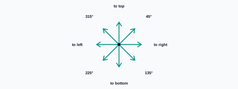
That means the four diagonal options in this tool map to actual corners like this:
| Direction | Points toward |
|---|---|
| 45° | Top-right corner |
| 135° | Bottom-right corner |
| 225° | Bottom-left corner |
| 315° | Top-left corner |
How to Create a CSS Gradient, Step by Step
Step 1: Open the Gradient Generator
Go to My PDF's Gradient Generator. No installation or account needed.
Step 2: Pick Your Start and End Colors
Use the color pickers to choose where the gradient begins and where it ends.
Step 3: Choose Linear or Radial
Pick the gradient type based on the effect you're going for — a directional flow, or an outward glow from the center.
Step 4: Set a Direction (Linear Only)
Choose one of the four keyword directions or four diagonal angles — direction doesn't apply to the radial option, since it always radiates from the center.
Step 5: Copy the Generated CSS
The live preview updates instantly as you adjust anything, and the ready-to-use background declaration is right below it.
Practical Examples
A hero section background between two brand colors. Pick your two brand colors, choose a linear gradient with a horizontal or diagonal direction, and get a background that feels intentional rather than a flat single-color fill.
A button with subtle depth. A gentle linear gradient — two closely related shades rather than two very different colors — adds visual dimension to a button without looking loud or distracting from its label.
A spotlight effect behind a logo. A radial gradient, light in the center and darker toward the edges, draws attention toward centered content without needing an actual image file.
Building a gradient from a palette you've already generated. After creating a palette with Color Palette Generator, use two colors from an analogous or complementary result as your gradient's start and end — the colors already relate to each other by design, so the gradient reads as cohesive rather than arbitrary.
Common Mistakes When Creating a Gradient
Assuming "to right" describes the starting side. It describes the direction the gradient moves toward — your first color is on the opposite side from wherever the keyword points.
Expecting a repositioned or elliptical radial gradient. This tool's radial option is always a centered circle. A different shape or off-center position needs manual adjustment to the generated code.
Choosing two colors with too little contrast. A gradient between two very similar shades can end up looking like a flat, muddy fill rather than a visible transition — increase the contrast between the two if the effect isn't reading clearly.
Pasting the code where a different CSS property is expected. The generated code is a background declaration — it won't work if pasted somewhere expecting background-color or border syntax specifically.
Not checking text readability across the whole gradient. A color pairing that transitions smoothly can still fail contrast for text placed on top of it in certain sections, especially near the lighter end of a gradient.
Tips & Best Practices
- Pull colors from a generated palette rather than picking two unrelated colors at random, for a gradient that feels designed rather than accidental.
- Keep contrast moderate but visible — enough that the transition actually reads as a gradient rather than a flat block of color.
- Match direction to your layout's shape — horizontal for wide banners, vertical for tall sections, diagonal for something more dynamic.
- Check text contrast across the full gradient, not just at one end, if you're placing text over it.
- Copy the generated code directly rather than retyping the color values by hand, to avoid a transcription mistake.
Key Takeaways
- A CSS gradient is a lightweight, scalable color transition rendered as a
backgroundvalue — no image file required. - Linear gradients flow in a chosen direction; radial gradients radiate outward from a center point, which this tool always keeps centered.
- Direction keywords describe where the gradient is heading toward, not where it starts, and angle values begin at 0° pointing up rather than right.
- Pulling colors from an already-generated palette produces a more cohesive gradient than picking two unrelated colors.
- Always check text contrast across the full gradient before placing text on top of it, not just at one end.
Related Reading
If you want to build a full palette before choosing your gradient colors, how to generate a color palette online covers the harmony styles this pairs naturally with. For more guides like this one, browse the full blog or the complete tools directory. For the full CSS gradient specification, including options beyond what this tool exposes, see MDN's documentation on CSS gradients.
Ready to build a gradient background? Open the Gradient Generator and copy the CSS in seconds.
Comments
Comments aren't open on the blog yet. In the meantime, share this article using the buttons above, or reach us directly at contact@mypdf.tech.